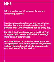
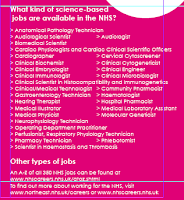
Have started on a double page spread design for Newcastle Science City magazine, on the topic of the NHS, built on Adobe InDesign.
However, my plight in creating a banner image to straddle both pages has fallen down, as I do not have a raw .psd file of the “swoosh” strands at the top of the pages, and haven’t been quite as successful as I’d have liked in removing the white from a .tif version of the banner, and as such, looks like it’s been chewed by someone’s dog.
It looks alright for a bit, then it bleeds together horrendously…
So I had to decide against the banner and run without it.
After that, I pasted the text into text boxes on the lower pink half of the pages, using white Century Gothic font, and left alignment, keeping the text under the correct headers in four columns.
 For the first column (left-most), I decided to make the text bold and slightly bigger to stand out, and stretched the body text box to fill the entire column, vertically aligning the text to the centre, and doing a similar thing with the sub-header, stretching the text box between the main header and the body text below.
Since the header of this column is the header of the whole page, I made it bigger than the sub-header.
 The second and third columns were done differently, with the text kept in Standard (rather than Bold), and slightly smaller than the first column's body, the headers about the same size as the first column's sub-header.
For the last column (righter-most) I mimicked the second and third columns, but found that the content (which was a list) was too much for the space I had, if I were to have each job name on a single line.
So instead, I staggered some of the list, creating a second mini-column within the column, reducing the amount of vertical space taken up, and allowing the contact details to be included in the space below.
For the last part of the page, I added in a circular image, and a circular text box with additional information in, each bordered in the same pink used for the lower half of the page, and positioned the text just above the righter-most column, and the image in the top right of the left-hand page, linking the two with a pink dotted line, weight 8 pt.


No comments:
Post a Comment